
Gender
| Category | Count | % |
|---|---|---|
| Male | 80 | 53.3 |
| Female | 70 | 46.7 |

If you find the content useful and wish to support our platform’s development, you can contribute any amount toward our production costs. Scan the UPI QR code for payment within India. Or use the Ko-fi link to process a secure payment via PayPal.
Statistics is often described as the science of learning from data. Before statistical models are fitted, hypotheses are tested, or Machine Learning algorithms are trained, analysts typically perform one essential task: they visualize the data. A well-designed graph can reveal patterns, trends, clusters, relationships, unusual observations, and potential errors that may remain hidden within numerical tables. Consequently, data visualization has become an indispensable component of modern statistics, business analytics, artificial intelligence, and data science.
Human beings naturally recognize visual patterns much more effectively than long lists of numbers. Consider a dataset containing one hundred customer purchase amounts. Although it is possible to inspect every numerical value individually, it is much easier to understand the overall distribution by viewing a histogram or a boxplot. Similarly, relationships between two numerical variables often become immediately apparent when displayed on a scatterplot, whereas they may be difficult to detect from a spreadsheet alone. Effective visualizations therefore complement numerical summaries by providing intuitive insights into the underlying structure of the data.
In professional practice, data visualization serves two important purposes. The first is exploration, where analysts examine the characteristics of a dataset before selecting appropriate statistical techniques. This process is commonly known as Exploratory Data Analysis (EDA). During exploratory analysis, visualizations help identify skewed distributions, unusual observations, missing values, potential data entry errors, and relationships between variables. The second purpose is communication. After an analysis has been completed, charts and graphs provide an effective way of presenting findings to managers, researchers, policymakers, and other stakeholders who may not possess advanced statistical knowledge.
Modern artificial intelligence systems also depend heavily upon data visualization during model development. Data scientists routinely visualize datasets before training predictive models to ensure that variables are distributed appropriately, relationships are reasonable, and anomalies are understood rather than ignored. A machine learning model trained on poorly understood data may produce misleading or unreliable predictions regardless of the sophistication of the algorithm. Consequently, visualization represents one of the most important quality assurance steps in the entire analytical workflow.
Throughout this module, you will learn how different graphical techniques summarize different aspects of a dataset. Some visualizations describe the distribution of a single variable, while others compare groups or illustrate relationships between two numerical variables. Rather than memorizing graph types, you will learn to select the visualization that best answers a particular analytical question. This analytical mindset closely reflects the workflow used by professional statisticians, business analysts, and data scientists.
After completing this module, you should be able to:
The following dataset contains 150 customer records and includes variables relating to customer characteristics and purchasing activity.
Use the tabs below to move between the complete dataset, the data dictionary, numerical summaries, categorical frequency tables, and interactive visualisations.
LearnerBox Interactive Dataset
| Customer ID | Age | Gender | Region | Education | Employment Status | Location | Marital Status | Card Loyalty | Income | Purchase Amount | Credit Score | Savings Balance | Satisfaction Pre | Satisfaction Post | ResponseTime Pre | ResponseTime Post | EntertainmentSessions Pre | EntertainmentSessions Post |
|---|---|---|---|---|---|---|---|---|---|---|---|---|---|---|---|---|---|---|
| CP001 | 90 | Male | 1 | 2 | 1 | 1 | 0 | 1 | 110320 | 977 | 739 | 29216 | 5.98 | 6.54 | 10.3 | 8.1 | 4 | 14 |
| CP002 | 63 | Female | 4 | 1 | 1 | 1 | 1 | 0 | 84482 | 685 | 682 | 33927 | 5.75 | 7.39 | 8.9 | 6.4 | 4 | 13 |
| CP003 | 96 | Female | 3 | 1 | 1 | 1 | 1 | 0 | 93518 | 671 | 655 | 31386 | 6.1 | 6.11 | 10.6 | 8.1 | 3 | 14 |
| CP004 | 84 | Female | 2 | 3 | 1 | 1 | 0 | 0 | 117772 | 792 | 649 | 30314 | 6.02 | 7.63 | 12.6 | 10.6 | 4 | 13 |
| CP005 | 99 | Male | 1 | 3 | 1 | 0 | 1 | 1 | 106703 | 868 | 710 | 24143 | 5.09 | 6.61 | 8.7 | 4.9 | 0 | 12 |
| CP006 | 49 | Male | 3 | 4 | 1 | 0 | 1 | 0 | 92826 | 768 | 685 | 14466 | 6.38 | 7.58 | 8.7 | 4.2 | 1 | 6 |
| CP007 | 82 | Male | 3 | 4 | 1 | 1 | 1 | 1 | 117682 | 958 | 666 | 33995 | 6.22 | 6.82 | 12.7 | 7.2 | 2 | 9 |
| CP008 | 53 | Female | 2 | 2 | 1 | 1 | 1 | 1 | 86744 | 826 | 643 | 29573 | 6.33 | 6.41 | 10.9 | 6.7 | 1 | 11 |
| CP009 | 59 | Female | 4 | 2 | 1 | 0 | 1 | 0 | 86331 | 704 | 657 | 19539 | 5.51 | 6.2 | 8.2 | 4.8 | 0 | 17 |
| CP010 | 71 | Female | 3 | 2 | 1 | 1 | 1 | 1 | 99112 | 878 | 616 | 34596 | 5.82 | 5.84 | 10.4 | 6.5 | 2 | 14 |
| CP011 | 90 | Male | 1 | 3 | 1 | 1 | 1 | 0 | 111682 | 746 | 726 | 31265 | 6.34 | 7.19 | 8.2 | 6.7 | 2 | 10 |
| CP012 | 99 | Female | 2 | 2 | 1 | 1 | 0 | 1 | 102734 | 874 | 768 | 28014 | 6.63 | 7.08 | 8.2 | 4.2 | 1 | 13 |
| CP013 | 82 | Female | 1 | 3 | 1 | 1 | 0 | 1 | 220000 | 872 | 650 | 31491 | 4.9 | 5.15 | 9.7 | 5.7 | 0 | 11 |
| CP014 | 54 | Male | 3 | 3 | 1 | 0 | 1 | 0 | 102060 | 709 | 603 | 15173 | 6.25 | 6.92 | 5 | 1.5 | 3 | 14 |
| CP015 | 54 | Male | 1 | 3 | 0 | 0 | 0 | 0 | 76049 | 617 | 536 | 18646 | 5.39 | 5.47 | 5.4 | 2.7 | 2 | 6 |
| CP016 | 79 | Male | 3 | 3 | 0 | 1 | 1 | 1 | 81157 | 759 | 580 | 9526 | 7.81 | 8.82 | 8 | 3.6 | 2 | 8 |
| CP017 | 40 | Male | 3 | 2 | 1 | 1 | 1 | 0 | 93919 | 707 | 540 | 28296 | 8.87 | 9.54 | 7 | 3 | 0 | 8 |
| CP018 | 29 | Female | 4 | 5 | 1 | 1 | 0 | 0 | 99743 | 715 | 508 | 30529 | 5.39 | 6.54 | 9.9 | 8.4 | 0 | 10 |
| CP019 | 49 | Male | 2 | 4 | 1 | 1 | 1 | 0 | 96302 | 686 | 591 | 25589 | 5.7 | 5.38 | 7.2 | 1.7 | 4 | 16 |
| CP020 | 43 | Male | 4 | 1 | 1 | 1 | 0 | 0 | 74584 | 474 | 504 | 24544 | 4.65 | 3.92 | 6.1 | 1.5 | 0 | 16 |
| CP021 | 44 | Female | 1 | 4 | 1 | 1 | 1 | 1 | 102069 | 927 | 601 | 33809 | 5.44 | 5.9 | 12.4 | 8.4 | 1 | 7 |
| CP022 | 39 | Male | 4 | 3 | 1 | 0 | 0 | 0 | 93758 | 687 | 503 | 14406 | 6.04 | 7.96 | 8.7 | 6.9 | 2 | 9 |
| CP023 | 24 | Male | 1 | 4 | 1 | 1 | 1 | 0 | 93973 | 720 | 548 | 26257 | 6.11 | 5.61 | 9.3 | 3.5 | 4 | 10 |
| CP024 | 22 | Male | 2 | 4 | 1 | 1 | 0 | 0 | 96261 | 537 | 569 | 31237 | 6.01 | 7.21 | 6.1 | 4.9 | 1 | 8 |
| CP025 | 99 | Male | 3 | 3 | 1 | 0 | 1 | 1 | 107399 | 992 | 633 | 21297 | 6.35 | 7.9 | 8 | 3.2 | 1 | 7 |
| CP026 | 55 | Female | 1 | 1 | 1 | 0 | 0 | 0 | 89197 | 659 | 602 | 18077 | 6.04 | 8.05 | 9.4 | 2.6 | 0 | 14 |
| CP027 | 51 | Male | 1 | 2 | 1 | 1 | 1 | 1 | 88351 | 848 | 627 | 31824 | 5.33 | 6.24 | 6.7 | 4 | 0 | 13 |
| CP028 | 75 | Female | 3 | 3 | 1 | 1 | 1 | 0 | 110617 | 722 | 622 | 28792 | 5.56 | 6.93 | 10 | 6.8 | 0 | 5 |
| CP029 | 38 | Female | 3 | 3 | 1 | 1 | 0 | 1 | 93825 | 870 | 629 | 25118 | 6.94 | 6.97 | 7.9 | 3.7 | 3 | 10 |
| CP030 | 96 | Male | 3 | 2 | 1 | 1 | 1 | 0 | 106883 | 682 | 723 | 35193 | 5.32 | 6.59 | 8.6 | 6.2 | 2 | 9 |
| CP031 | 83 | Female | 3 | 1 | 1 | 1 | 0 | 0 | 94867 | 664 | 627 | 28519 | 4.63 | 5.57 | 7.9 | 5.9 | 2 | 16 |
| CP032 | 28 | Male | 2 | 4 | 0 | 0 | 0 | 0 | 73743 | 665 | 500 | 11622 | 5.82 | 6.6 | 13.3 | 9.2 | 1 | 11 |
| CP033 | 54 | Male | 2 | 5 | 1 | 1 | 1 | 1 | 116906 | 925 | 663 | 35676 | 5.31 | 5.68 | 9.2 | 7.6 | 2 | 11 |
| CP034 | 91 | Female | 2 | 3 | 1 | 1 | 0 | 1 | 117262 | 968 | 718 | 33395 | 6.86 | 6.66 | 6.9 | 2.3 | 2 | 9 |
| CP035 | 96 | Female | 1 | 1 | 1 | 1 | 1 | 0 | 97436 | 751 | 708 | 31112 | 6.24 | 7.19 | 11 | 8.2 | 0 | 9 |
| CP036 | 58 | Female | 4 | 2 | 1 | 1 | 0 | 1 | 94633 | 868 | 567 | 35959 | 5.87 | 7.3 | 6.5 | 1.5 | 1 | 9 |
| CP037 | 70 | Male | 3 | 1 | 1 | 0 | 1 | 1 | 86727 | 792 | 618 | 13743 | 6.69 | 7.55 | 9.7 | 7.7 | 3 | 11 |
| CP038 | 34 | Male | 2 | 5 | 1 | 0 | 1 | 0 | 113878 | 788 | 538 | 21172 | 7.28 | 7.96 | 4.9 | 2.3 | 2 | 19 |
| CP039 | 98 | Female | 2 | 1 | 1 | 1 | 0 | 0 | 94371 | 813 | 683 | 29609 | 8.24 | 10 | 6.3 | 2.2 | 4 | 13 |
| CP040 | 39 | Male | 4 | 3 | 1 | 1 | 0 | 0 | 101492 | 705 | 544 | 30955 | 7.28 | 8.65 | 9.6 | 7.2 | 0 | 12 |
| CP041 | 96 | Male | 1 | 2 | 1 | 1 | 1 | 0 | 104196 | 732 | 670 | 35005 | 6 | 5.89 | 10.8 | 6.5 | 0 | 13 |
| CP042 | 72 | Male | 3 | 3 | 1 | 1 | 0 | 1 | 97037 | 888 | 687 | 31228 | 1.04 | 1.3 | 9.6 | 3.9 | 0 | 13 |
| CP043 | 69 | Male | 2 | 3 | 1 | 1 | 1 | 1 | 103658 | 924 | 688 | 31981 | 7.65 | 8.46 | 8.9 | 8 | 0 | 8 |
| CP044 | 61 | Female | 3 | 4 | 1 | 1 | 1 | 1 | 104951 | 955 | 656 | 33713 | 5.22 | 5.2 | 8.5 | 4.3 | 1 | 11 |
| CP045 | 39 | Male | 1 | 2 | 1 | 1 | 1 | 0 | 88662 | 676 | 511 | 27772 | 6.32 | 5.75 | 5.9 | 2.6 | 2 | 12 |
| CP046 | 35 | Female | 4 | 1 | 0 | 1 | 1 | 0 | 46680 | 4500 | 449 | 3151 | 6.06 | 6.79 | 7.6 | 2.6 | 2 | 8 |
| CP047 | 38 | Male | 4 | 1 | 1 | 1 | 1 | 1 | 73943 | 802 | 572 | 24260 | 6.87 | 6.36 | 8.2 | 5.8 | 5 | 8 |
| CP048 | 35 | Female | 3 | 5 | 1 | 1 | 1 | 1 | 97773 | 802 | 571 | 23879 | 6.19 | 5.34 | 11.5 | 10.2 | 1 | 7 |
| CP049 | 83 | Female | 3 | 4 | 1 | 1 | 0 | 1 | 113567 | 953 | 785 | 37526 | 5.21 | 5.17 | 10 | 5.3 | 3 | 9 |
| CP050 | 48 | Male | 4 | 3 | 1 | 1 | 0 | 1 | 83685 | 731 | 579 | 25059 | 2.77 | 3.52 | 5.3 | 1.9 | 4 | 14 |
| CP051 | 25 | Female | 3 | 3 | 1 | 1 | 0 | 1 | 79701 | 766 | 516 | 27307 | 5.69 | 6.59 | 9.9 | 5.6 | 2 | 10 |
| CP052 | 98 | Female | 1 | 3 | 1 | 0 | 1 | 0 | 116937 | 822 | 717 | 17864 | 6.53 | 6.95 | 8.4 | 4.9 | 3 | 10 |
| CP053 | 91 | Female | 3 | 1 | 1 | 1 | 1 | 0 | 98676 | 730 | 684 | 30790 | 6.68 | 6.71 | 7.7 | 5.6 | 2 | 11 |
| CP054 | 95 | Female | 3 | 5 | 1 | 1 | 0 | 1 | 130105 | 1042 | 743 | 35458 | 6.1 | 7.29 | 10.5 | 7.2 | 1 | 8 |
| CP055 | 95 | Female | 2 | 3 | 1 | 1 | 0 | 1 | 109023 | 996 | 746 | 33484 | 7.1 | 8.09 | 11.5 | 7.1 | 4 | 13 |
| CP056 | 34 | Female | 3 | 2 | 1 | 1 | 1 | 0 | 82631 | 656 | 571 | 26514 | 5.6 | 5.59 | 11.2 | 9.2 | 1 | 11 |
| CP057 | 52 | Male | 4 | 3 | 1 | 1 | 0 | 0 | 97077 | 674 | 566 | 29207 | 7.38 | 7.99 | 7.4 | 1.5 | 3 | 12 |
| CP058 | 81 | Male | 4 | 1 | 1 | 1 | 0 | 1 | 85439 | 826 | 579 | 29392 | 4.42 | 4.5 | 8.5 | 4.9 | 1 | 6 |
| CP059 | 76 | Male | 2 | 1 | 1 | 0 | 0 | 0 | 97006 | 745 | 572 | 15955 | 6.49 | 6.6 | 9.9 | 8.5 | 1 | 7 |
| CP060 | 33 | Male | 1 | 4 | 1 | 1 | 0 | 0 | 102696 | 653 | 590 | 35092 | 5.93 | 6.39 | 11.3 | 7.5 | 3 | 15 |
| CP061 | 86 | Male | 4 | 1 | 1 | 1 | 0 | 0 | 91739 | 689 | 610 | 30647 | 6.08 | 6.57 | 8.1 | 6.4 | 0 | 12 |
| CP062 | 38 | Male | 4 | 3 | 0 | 1 | 1 | 1 | 67419 | 723 | 425 | 9947 | 5.87 | 6.83 | 8.8 | 4.8 | 0 | 11 |
| CP063 | 38 | Female | 1 | 2 | 1 | 1 | 0 | 1 | 85309 | 782 | 562 | 30520 | 6.19 | 6.37 | 6.8 | 2.3 | 2 | 21 |
| CP064 | 63 | Male | 4 | 2 | 1 | 1 | 0 | 0 | 82827 | 683 | 691 | 31804 | 6.02 | 6.48 | 6.6 | 3.6 | 0 | 8 |
| CP065 | 68 | Male | 4 | 2 | 1 | 0 | 1 | 1 | 93367 | 810 | 621 | 16880 | 6.64 | 7.8 | 11 | 6.7 | 1 | 14 |
| CP066 | 67 | Female | 2 | 2 | 1 | 1 | 1 | 0 | 90833 | 681 | 648 | 25193 | 7.72 | 8.31 | 12.2 | 7.6 | 2 | 17 |
| CP067 | 28 | Male | 3 | 4 | 1 | 0 | 1 | 0 | 91554 | 650 | 541 | 17355 | 4.85 | 4.93 | 9 | 4 | 0 | 16 |
| CP068 | 91 | Female | 2 | 2 | 1 | 0 | 0 | 1 | 101164 | 877 | 679 | 15163 | 6.28 | 6.89 | 11.4 | 5.9 | 2 | 10 |
| CP069 | 42 | Male | 1 | 3 | 1 | 1 | 0 | 1 | 102426 | 808 | 624 | 28657 | 4.24 | 4.31 | 10 | 7.3 | 5 | 12 |
| CP070 | 31 | Female | 2 | 3 | 1 | 1 | 1 | 1 | 92831 | 763 | 535 | 31043 | 6.21 | 6.75 | 7.8 | 4.8 | 4 | 15 |
| CP071 | 92 | Female | 4 | 3 | 1 | 1 | 1 | 1 | 108030 | 990 | 709 | 34518 | 4.68 | 4.28 | 10 | 7.2 | 1 | 15 |
| CP072 | 97 | Male | 1 | 5 | 0 | 1 | 1 | 0 | 106622 | 691 | 719 | 11726 | 4.02 | 6.05 | 12.6 | 9.6 | 1 | 12 |
| CP073 | 89 | Male | 2 | 4 | 1 | 1 | 0 | 0 | 125137 | 777 | 701 | 33441 | 7.61 | 7.17 | 9.1 | 6.2 | 0 | 10 |
| CP074 | 85 | Female | 2 | 2 | 1 | 1 | 0 | 0 | 105290 | 639 | 720 | 35636 | 7.24 | 8.92 | 12.6 | 8.2 | 0 | 12 |
| CP075 | 73 | Female | 2 | 1 | 1 | 1 | 0 | 0 | 88645 | 632 | 615 | 29587 | 4.87 | 4.97 | 4 | 1.5 | 4 | 17 |
| CP076 | 65 | Female | 4 | 2 | 0 | 1 | 1 | 0 | 65190 | 480 | 528 | 15324 | 1.64 | 2.48 | 11 | 6.9 | 2 | 12 |
| CP077 | 27 | Female | 2 | 3 | 1 | 0 | 1 | 1 | 91927 | 912 | 559 | 17890 | 5.99 | 5.87 | 9.4 | 5.4 | 1 | 14 |
| CP078 | 53 | Male | 2 | 1 | 1 | 1 | 1 | 0 | 83405 | 668 | 536 | 23059 | 4.93 | 4.12 | 8.5 | 3.7 | 1 | 16 |
| CP079 | 50 | Male | 3 | 3 | 0 | 0 | 1 | 1 | 75912 | 696 | 553 | 14852 | 7.69 | 7.9 | 9.4 | 6.7 | 3 | 12 |
| CP080 | 41 | Male | 2 | 3 | 0 | 1 | 0 | 1 | 71449 | 820 | 524 | 9289 | 7.22 | 7.96 | 4.8 | 1.5 | 4 | 18 |
| CP081 | 78 | Female | 1 | 2 | 1 | 1 | 0 | 1 | 103504 | 937 | 706 | 34220 | 5.14 | 5.09 | 8.7 | 3.9 | 3 | 14 |
| CP082 | 60 | Female | 2 | 4 | 1 | 1 | 0 | 0 | 105209 | 730 | 649 | 32541 | 5.36 | 5.08 | 10 | 7.1 | 0 | 11 |
| CP083 | 27 | Male | 1 | 1 | 1 | 1 | 0 | 0 | 78857 | 470 | 510 | 27471 | 8.28 | 8.78 | 12.5 | 9.8 | 3 | 15 |
| CP084 | 38 | Male | 1 | 1 | 1 | 0 | 1 | 0 | 77154 | 701 | 562 | 11043 | 6.56 | 7.6 | 8.1 | 4.4 | 2 | 12 |
| CP085 | 75 | Male | 2 | 4 | 0 | 0 | 0 | 0 | 98508 | 624 | 702 | 14224 | 7.2 | 7.45 | 7.4 | 3.7 | 1 | 18 |
| CP086 | 27 | Male | 2 | 3 | 1 | 0 | 0 | 1 | 84686 | 692 | 544 | 12918 | 6.48 | 7.27 | 8.1 | 4.2 | 1 | 14 |
| CP087 | 89 | Female | 4 | 3 | 1 | 1 | 0 | 0 | 118514 | 864 | 714 | 30110 | 7.31 | 8.25 | 11.2 | 7.6 | 4 | 16 |
| CP088 | 60 | Female | 2 | 3 | 1 | 1 | 1 | 0 | 100854 | 847 | 150 | 31852 | 6.04 | 5.68 | 9.9 | 7 | 2 | 10 |
| CP089 | 59 | Female | 3 | 2 | 1 | 0 | 1 | 1 | 88200 | 881 | 551 | 20830 | 6.91 | 6.37 | 8 | 6.1 | 5 | 8 |
| CP090 | 68 | Male | 3 | 4 | 1 | 0 | 1 | 0 | 108168 | 770 | 639 | 19001 | 7.04 | 6.5 | 10.3 | 8.3 | 2 | 15 |
| CP091 | 86 | Male | 1 | 4 | 1 | 0 | 0 | 1 | 115490 | 958 | 679 | 14962 | 7.25 | 7.63 | 9.4 | 7 | 0 | 15 |
| CP092 | 48 | Female | 3 | 3 | 1 | 1 | 0 | 1 | 97860 | 902 | 584 | 31120 | 5.68 | 5.09 | 11.3 | 6.2 | 3 | 13 |
| CP093 | 75 | Female | 1 | 2 | 1 | 1 | 1 | 1 | 99599 | 906 | 650 | 33550 | 9.2 | 9.19 | 7.7 | 4.4 | 4 | 11 |
| CP094 | 66 | Female | 4 | 3 | 1 | 0 | 0 | 0 | 98972 | 729 | 650 | 15068 | 5.77 | 6.58 | 8.5 | 7.1 | 2 | 20 |
| CP095 | 42 | Female | 1 | 2 | 1 | 1 | 0 | 0 | 85356 | 652 | 551 | 28134 | 6.71 | 7.4 | 8.3 | 4.1 | 0 | 7 |
| CP096 | 91 | Male | 2 | 1 | 1 | 0 | 1 | 1 | 105313 | 874 | 711 | 17576 | 1 | 1.66 | 6 | 1.5 | 6 | 17 |
| CP097 | 84 | Female | 1 | 5 | 1 | 0 | 1 | 0 | 132966 | 848 | 736 | 17942 | 5.56 | 6.63 | 9.9 | 8 | 1 | 14 |
| CP098 | 73 | Male | 4 | 1 | 1 | 1 | 0 | 1 | 90619 | 790 | 548 | 31007 | 2.99 | 2.5 | 9.8 | 6.6 | 2 | 9 |
| CP099 | 88 | Male | 2 | 5 | 1 | 0 | 1 | 1 | 126007 | 896 | 691 | 19238 | 5.19 | 6.02 | 9.2 | 6.1 | 2 | 10 |
| CP100 | 90 | Male | 3 | 3 | 1 | 0 | 0 | 1 | 110885 | 900 | 695 | 19348 | 9.14 | 10 | 8.7 | 6.2 | 0 | 11 |
| CP101 | 77 | Male | 1 | 1 | 1 | 1 | 1 | 0 | 92902 | 616 | 591 | 26628 | 6.7 | 6.59 | 8.19 | 5.69 | 2.2 | 9.2 |
| CP102 | 87 | Female | 3 | 3 | 1 | 0 | 0 | 0 | 104323 | 687 | 707 | 16120 | 5.81 | 5.84 | 8.86 | 6.86 | 2.98 | 9.98 |
| CP103 | 76 | Male | 1 | 4 | 1 | 1 | 1 | 1 | 112243 | 921 | 737 | 33392 | 6.91 | 6.99 | 6.17 | 2.17 | -0.04 | 4.96 |
| CP104 | 75 | Female | 4 | 4 | 1 | 0 | 1 | 0 | 104702 | 814 | 707 | 16352 | 8.12 | 7.55 | 11.04 | 8.44 | -0.16 | 15.84 |
| CP105 | 70 | Female | 1 | 4 | 1 | 1 | 0 | 0 | 113318 | 833 | 657 | 36513 | 5.68 | 6.84 | 10.77 | 9.57 | 2.59 | 8.59 |
| CP106 | 81 | Male | 1 | 3 | 0 | 0 | 1 | 0 | 85313 | 549 | 691 | 12333 | 5.68 | 5.14 | 9.02 | 6.32 | 2.25 | 9.25 |
| CP107 | 33 | Male | 1 | 3 | 1 | 1 | 1 | 1 | 88026 | 741 | 547 | 29477 | 8.2 | 7.8 | 7.92 | 4.72 | 2.18 | 12.18 |
| CP108 | 91 | Female | 2 | 4 | 1 | 1 | 1 | 1 | 126535 | 1050 | 721 | 35452 | 7.07 | 7.76 | 6.02 | 3.02 | 2.33 | 5.33 |
| CP109 | 90 | Male | 3 | 2 | 1 | 0 | 0 | 0 | 96283 | 633 | 648 | 12374 | 5.35 | 4.99 | 7.42 | 3.52 | 0.79 | 13.79 |
| CP110 | 23 | Male | 1 | 3 | 1 | 1 | 0 | 0 | 79498 | 587 | 492 | 22668 | 6.76 | 7.32 | 10.45 | 8.95 | 2.16 | 8.16 |
| CP111 | 87 | Male | 3 | 2 | 1 | 1 | 0 | 1 | 102246 | 889 | 661 | 25648 | 5.36 | 5.44 | 8.56 | 4.16 | 2.25 | 17.25 |
| CP112 | 31 | Male | 2 | 5 | 1 | 0 | 1 | 1 | 110844 | 856 | 589 | 21873 | 5.36 | 5 | 8.13 | 6.23 | 0.74 | 13.74 |
| CP113 | 47 | Female | 2 | 5 | 1 | 0 | 1 | 0 | 119803 | 825 | 640 | 17325 | 6.34 | 6.52 | 9.97 | 7.07 | 4.6 | 13.6 |
| CP114 | 80 | Female | 2 | 1 | 1 | 1 | 1 | 0 | 88524 | 596 | 636 | 36527 | 3.35 | 4.2 | 11.27 | 9.87 | 2.52 | 15.52 |
| CP115 | 33 | Female | 2 | 4 | 1 | 1 | 1 | 1 | 103895 | 860 | 591 | 28697 | 3.61 | 3.56 | 9.49 | 6.49 | 0.03 | 8.03 |
| CP116 | 86 | Female | 3 | 5 | 0 | 1 | 1 | 1 | 99711 | 885 | 718 | 11525 | 5.22 | 5.3 | 9.6 | 6.3 | 2.79 | 11.79 |
| CP117 | 87 | Female | 1 | 1 | 1 | 1 | 1 | 1 | 92437 | 753 | 696 | 33870 | 4.6 | 5.55 | 11.69 | 8.39 | 0.35 | 17.35 |
| CP118 | 61 | Male | 1 | 3 | 0 | 1 | 1 | 1 | 79628 | 771 | 521 | 14982 | 6.44 | 7.39 | 9.33 | 6.83 | 2.99 | 10.99 |
| CP119 | 21 | Female | 4 | 5 | 1 | 1 | 0 | 0 | 105441 | 747 | 450 | 36729 | 4.74 | 5.11 | 8.37 | 3.77 | 3.54 | 9.54 |
| CP120 | 43 | Female | 4 | 1 | 1 | 0 | 1 | 0 | 70156 | 599 | 564 | 17641 | 4.04 | 5.56 | 10.31 | 8.91 | 0.58 | 9.58 |
| CP121 | 70 | Female | 2 | 3 | 0 | 0 | 1 | 1 | 85657 | 810 | 555 | 16638 | 8.04 | 7.93 | 8.47 | 3.47 | 3.25 | 10.25 |
| CP122 | 99 | Female | 2 | 2 | 1 | 0 | 0 | 1 | 112374 | 1001 | 713 | 20015 | 5.69 | 7.06 | 8.25 | 2.75 | 2.43 | 15.43 |
| CP123 | 71 | Male | 3 | 5 | 1 | 1 | 1 | 1 | 116563 | 940 | 627 | 33992 | 6.1 | 6.7 | 11.5 | 9.5 | 3.04 | 17.04 |
| CP124 | 41 | Male | 2 | 5 | 1 | 1 | 0 | 1 | 111254 | 885 | 532 | 29472 | 4.02 | 3.58 | 8.4 | 3.4 | 4.65 | 12.65 |
| CP125 | 71 | Male | 1 | 5 | 1 | 1 | 0 | 0 | 122223 | 818 | 708 | 29768 | 5.25 | 7.28 | 3.72 | -1.78 | 1.44 | 11.44 |
| CP126 | 64 | Male | 1 | 3 | 1 | 1 | 0 | 0 | 102423 | 740 | 662 | 30233 | 6.16 | 6.61 | 9.66 | 5.06 | 0.68 | 6.68 |
| CP127 | 83 | Female | 3 | 4 | 1 | 1 | 1 | 1 | 113085 | 938 | 668 | 30798 | 4.41 | 4.21 | 8.19 | 3.69 | 0.48 | 7.48 |
| CP128 | 29 | Female | 3 | 4 | 1 | 0 | 0 | 1 | 93638 | 841 | 441 | 15005 | 6.53 | 6.9 | 8.41 | 5.61 | 0.59 | 11.59 |
| CP129 | 81 | Male | 1 | 2 | 1 | 1 | 1 | 1 | 99182 | 811 | 638 | 32008 | 5.17 | 4.32 | 9.87 | 6.37 | 1.69 | 13.69 |
| CP130 | 64 | Female | 1 | 4 | 1 | 1 | 1 | 1 | 115020 | 912 | 672 | 34368 | 5.6 | 5.1 | 8.65 | 7.05 | 2.32 | 9.32 |
| CP131 | 97 | Male | 1 | 1 | 1 | 1 | 1 | 1 | 99682 | 779 | 634 | 30234 | 5.17 | 6.13 | 9.4 | 7 | 2.22 | 11.22 |
| CP132 | 48 | Male | 3 | 3 | 1 | 0 | 0 | 0 | 93720 | 757 | 589 | 20805 | 8.58 | 8.22 | 4.97 | 0.87 | 3.05 | 11.05 |
| CP133 | 71 | Male | 1 | 2 | 1 | 1 | 1 | 0 | 99572 | 636 | 640 | 26533 | 5.99 | 6.85 | 7.11 | 4.21 | 1.83 | 11.83 |
| CP134 | 95 | Male | 1 | 1 | 1 | 1 | 1 | 0 | 81855 | 575 | 676 | 27605 | 4.54 | 5.37 | 11.76 | 9.56 | 3.98 | 19.98 |
| CP135 | 29 | Female | 3 | 1 | 1 | 1 | 0 | 0 | 78615 | 578 | 518 | 25711 | 7.15 | 7.13 | 8.94 | 7.44 | 1.41 | 14.41 |
| CP136 | 95 | Male | 1 | 3 | 0 | 0 | 1 | 0 | 78544 | 638 | 608 | 7255 | 4.31 | 5.1 | 5.66 | 0.56 | 5.88 | 15.88 |
| CP137 | 75 | Female | 3 | 2 | 1 | 1 | 1 | 0 | 95449 | 683 | 689 | 29297 | 6.3 | 6.68 | 6.85 | 0.95 | 2.75 | 8.75 |
| CP138 | 26 | Female | 1 | 4 | 1 | 0 | 1 | 0 | 90302 | 734 | 525 | 15665 | 3.28 | 4.23 | 7.01 | 5.11 | 0.53 | 11.53 |
| CP139 | 45 | Male | 1 | 1 | 1 | 0 | 1 | 0 | 71954 | 527 | 531 | 18736 | 4.16 | 5.32 | 9.18 | 5.78 | 0.21 | 10.21 |
| CP140 | 77 | Female | 1 | 2 | 1 | 1 | 1 | 0 | 103633 | 753 | 623 | 32256 | 6.28 | 7.11 | 8.12 | 2.32 | 2.53 | 14.53 |
| CP141 | 26 | Female | 3 | 3 | 1 | 1 | 1 | 0 | 85548 | 606 | 504 | 25483 | 7.03 | 6.52 | 7.67 | 5.67 | 1.48 | 5.48 |
| CP142 | 67 | Male | 4 | 4 | 1 | 0 | 0 | 0 | 112034 | 868 | 622 | 23766 | 6.24 | 5.43 | 8.99 | 7.59 | 2.88 | 12.88 |
| CP143 | 48 | Male | 4 | 2 | 1 | 1 | 1 | 1 | 87451 | 728 | 563 | 32409 | 5.84 | 5.85 | 9.92 | 4.22 | 2.52 | 9.52 |
| CP144 | 70 | Male | 2 | 3 | 1 | 1 | 1 | 0 | 105771 | 745 | 719 | 32324 | 5.59 | 6.15 | 8.47 | 5.37 | 1.7 | 16.7 |
| CP145 | 24 | Male | 3 | 4 | 1 | 0 | 0 | 0 | 95665 | 711 | 484 | 15888 | 3.95 | 5.47 | 7.84 | 2.34 | 0.54 | 10.54 |
| CP146 | 90 | Male | 1 | 3 | 0 | 0 | 1 | 0 | 78989 | 616 | 573 | 10021 | 5 | 4.46 | 8.14 | 3.74 | -0.46 | 11.54 |
| CP147 | 98 | Female | 2 | 2 | 1 | 0 | 0 | 1 | 110240 | 912 | 775 | 16908 | 5.37 | 6.04 | 9.65 | 7.65 | 1.14 | 20.14 |
| CP148 | 98 | Female | 4 | 1 | 1 | 0 | 1 | 0 | 94660 | 687 | 676 | 19733 | 7.47 | 8.38 | 8.96 | 5.16 | 3.09 | 16.09 |
| CP149 | 80 | Male | 1 | 4 | 0 | 1 | 1 | 1 | 82208 | 764 | 598 | 14875 | 6.48 | 7.17 | 10.5 | 8 | 2.13 | 10.13 |
| CP150 | 31 | Male | 1 | 1 | 1 | 1 | 1 | 0 | 71502 | 551 | 545 | 31780 | 3.55 | 3.76 | 6.7 | 4.5 | -0.05 | 5.95 |
| Variable | Type | Description |
|---|---|---|
Age |
Numeric | Age. |
Card_Loyalty |
Categorical | Customer card loyalty status: Regular or VIP. |
Credit_Score |
Numeric | Credit Score. |
Customer_ID |
Identifier | Customer ID. |
Education |
Categorical | Highest education category reported by the customer. |
Employment_Status |
Categorical | Employment status: Employed or Unemployed. |
EntertainmentSessions_Post |
Numeric | EntertainmentSessions Post. |
EntertainmentSessions_Pre |
Numeric | EntertainmentSessions Pre. |
Gender |
Categorical | Gender. |
Income |
Numeric | Income. |
Location |
Categorical | Customer location: Urban or Rural. |
Marital_Status |
Categorical | Marital status: Married or Unmarried. |
Purchase_Amount |
Numeric | Purchase Amount. |
Region |
Categorical | Customer region: North, East, West, or South. |
ResponseTime_Post |
Numeric | ResponseTime Post. |
ResponseTime_Pre |
Numeric | ResponseTime Pre. |
Satisfaction_Post |
Numeric | Satisfaction Post. |
Satisfaction_Pre |
Numeric | Satisfaction Pre. |
Savings_Balance |
Numeric | Savings Balance. |
Sample standard deviation is reported. Values are calculated directly from the CSV file when the page loads.
| Variable | N | Mean | Median | SD | Minimum | Maximum |
|---|---|---|---|---|---|---|
| Age | 150 | 64.03 | 68.00 | 23.80 | 21.00 | 99.00 |
| Income | 150 | 97,688.33 | 97,057.00 | 17,515.94 | 46,680.00 | 220,000.00 |
| Purchase Amount | 150 | 794.93 | 763.50 | 328.36 | 470.00 | 4,500.00 |
| Credit Score | 150 | 617.18 | 625.50 | 86.59 | 150.00 | 785.00 |
| Savings Balance | 150 | 25,046.87 | 27,538.00 | 8,092.54 | 3,151.00 | 37,526.00 |
| Satisfaction Pre | 150 | 5.90 | 6.02 | 1.36 | 1.00 | 9.20 |
| Satisfaction Post | 150 | 6.36 | 6.58 | 1.50 | 1.30 | 10.00 |
| ResponseTime Pre | 150 | 8.88 | 8.83 | 1.89 | 3.72 | 13.30 |
| ResponseTime Post | 150 | 5.49 | 5.74 | 2.40 | -1.78 | 10.60 |
| EntertainmentSessions Pre | 150 | 1.86 | 2.00 | 1.45 | -0.46 | 6.00 |
| EntertainmentSessions Post | 150 | 11.84 | 11.57 | 3.46 | 4.96 | 21.00 |
| Category | Count | % |
|---|---|---|
| Male | 80 | 53.3 |
| Female | 70 | 46.7 |
| Category | Count | % |
|---|---|---|
| North | 46 | 30.7 |
| West | 39 | 26.0 |
| East | 38 | 25.3 |
| South | 27 | 18.0 |
| Category | Count | % |
|---|---|---|
| Graduate | 45 | 30.0 |
| Diploma | 32 | 21.3 |
| High School | 30 | 20.0 |
| Bachelor | 28 | 18.7 |
| Post Graduate | 15 | 10.0 |
| Category | Count | % |
|---|---|---|
| Employed | 133 | 88.7 |
| Unemployed | 17 | 11.3 |
| Category | Count | % |
|---|---|---|
| Urban | 102 | 68.0 |
| Rural | 48 | 32.0 |
| Category | Count | % |
|---|---|---|
| Married | 86 | 57.3 |
| Unmarried | 64 | 42.7 |
| Category | Count | % |
|---|---|---|
| Regular | 82 | 54.7 |
| VIP | 68 | 45.3 |
Imagine that you are presented with a spreadsheet containing one hundred customer records. Each record includes variables such as annual income, purchase amount, website visits, customer satisfaction, and product category. Although every value is available, it is extremely difficult to recognise meaningful patterns simply by scanning rows of numbers. A histogram immediately reveals the shape of a distribution, a boxplot highlights unusual observations, and a scatterplot can uncover relationships between variables that may otherwise remain unnoticed. Effective data visualization therefore transforms large collections of numbers into meaningful visual information that supports statistical reasoning and informed decision-making.
Visual exploration represents the first stage of Exploratory Data Analysis (EDA), a systematic approach to understanding the characteristics of a dataset before performing formal statistical analyses. Rather than beginning with formulas or hypothesis tests, analysts first ask simple but important questions. What does the distribution look like? Are there unusually large or unusually small observations? Do two variables appear to move together? Are there groups that differ substantially from one another? These questions help determine which statistical techniques are appropriate and whether the data satisfy the assumptions required for those techniques.
Exploratory Data Analysis was popularised by the statistician John Tukey, who argued that analysts should first "listen to the data" before applying mathematical models. Although modern statistical software performs sophisticated calculations almost instantly, the underlying principle remains unchanged. Careful visual inspection frequently identifies patterns, inconsistencies, or data quality issues that would otherwise influence the validity of subsequent analyses. Consequently, exploratory visualization has become a standard practice in statistics, business analytics, artificial intelligence, and machine learning.
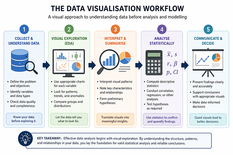
As illustrated in Figure 3.1, visualization acts as an important bridge between raw data and statistical analysis. Before calculating descriptive statistics, estimating regression models, or training machine learning algorithms, analysts first seek to understand the overall structure of the data. Visualizations often reveal characteristics that influence subsequent statistical decisions, including skewed distributions, clusters of observations, outliers, and potential measurement errors.
Suppose an analyst receives the LearnerBox Customer Purchases Dataset (LB-CP-100 V1). Before calculating descriptive statistics or fitting predictive models, what questions should be explored through data visualization?
A systematic exploratory analysis might include questions such as:
Each of these questions can be answered more effectively using appropriate graphical techniques than by examining numerical tables alone.
This example illustrates an important principle that will be followed throughout the remainder of this course: visual interpretation should generally precede numerical interpretation. Graphs provide an initial understanding of the data, allowing analysts to identify interesting patterns before computing statistical summaries or fitting analytical models.
Do not worry if you cannot answer every question immediately. By the end of this module, you will be able to interpret each of these characteristics confidently.
Notice that every visualization introduced throughout this module answers a different analytical question. Histograms describe distributions, boxplots summarise variability and identify potential outliers, scatterplots investigate relationships between numerical variables, while pie charts illustrate the relative proportions of categorical variables. Selecting the appropriate visualization therefore depends not on personal preference but on the specific analytical question being investigated.
This principle will guide the remainder of this module. Rather than learning graph types in isolation, you will learn to choose the visualization that best communicates the information contained within the data.
Analytical Question: What does the distribution of a numerical variable look like?
Among all statistical graphs, the histogram is one of the most widely used tools for exploring numerical data. Unlike tables of numbers, which often conceal important characteristics, a histogram provides an immediate visual summary of how observations are distributed across a range of values. It enables analysts to identify the centre of the distribution, the overall spread of the data, the presence of multiple peaks, and whether the distribution appears approximately symmetric or skewed. Consequently, histograms are almost always one of the first graphs produced during exploratory data analysis.
A histogram is constructed by dividing the range of a numerical variable into consecutive intervals, known as bins, and counting the number of observations that fall within each interval. The horizontal axis represents the values of the variable, while the vertical axis represents the corresponding frequencies. Because the bins represent continuous intervals, the bars in a histogram are adjacent to one another, illustrating that the underlying variable is quantitative rather than categorical. This distinguishes histograms from bar charts, whose bars are separated because they represent discrete categories.
Histograms provide valuable information about the overall shape of a distribution. For example, a histogram may reveal that the observations are approximately normally distributed, concentrated around a central value with similar frequencies on either side. Alternatively, the graph may indicate that the distribution is positively skewed, with a long tail extending toward larger values, or negatively skewed, with the tail extending toward smaller values. Histograms can also reveal multiple peaks (multimodality), unusually large gaps between observations, or isolated values that may warrant further investigation.
One important characteristic of a histogram is that it summarises the distribution without displaying individual observations. Although this makes the graph easier to interpret, it also means that the appearance of the histogram depends partly on the number and width of the bins selected. Too few bins may oversimplify the distribution, while too many bins may exaggerate minor fluctuations caused by random variation. Modern statistical software automatically selects sensible bin widths, although analysts should always examine whether the resulting histogram provides an informative representation of the data.
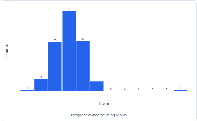
Figure 3.2 presents the distribution of Annual Income for customers contained within the LearnerBox Customer Purchases Dataset. Even before calculating descriptive statistics, several important observations can be made from the histogram. Most customers fall within the middle income ranges, while comparatively few occupy the lowest and highest income categories. The graph also allows us to determine whether the distribution appears approximately symmetric or exhibits noticeable skewness. Such observations provide useful context for interpreting subsequent numerical summaries such as the mean, median, standard deviation, and quartiles.
Use the LearnerBox Interactive Dataset to examine the distribution of Annual Income. Describe the overall shape of the histogram and identify any notable characteristics.
Select the following options within the LearnerBox Interactive Dataset Viewer.
Observe the resulting histogram carefully before calculating any descriptive statistics. Consider the following questions:
The histogram indicates that annual incomes are concentrated within the middle ranges, with relatively fewer customers occupying the extreme income levels. Although the precise numerical characteristics will be examined in later modules, the graph provides an immediate overview of the distribution and helps determine whether subsequent statistical techniques based on normality are likely to be appropriate.
Compare the three histograms. Which variable appears most symmetric? Which appears most skewed? Which variable shows the greatest variability? Try answering these questions using only the visualisations before examining any numerical summaries.
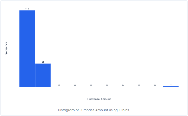
Figure 3.3 illustrates the distribution of Purchase Amount. Compared with Annual Income, the purchase amounts exhibit greater variability and may display a longer right-hand tail resulting from a small number of customers making unusually large purchases. Such positively skewed distributions are frequently encountered in retail and e-commerce data because relatively few customers account for a disproportionately large share of total sales. Visual inspection therefore helps analysts anticipate the presence of high-value observations before formal statistical analyses are undertaken.
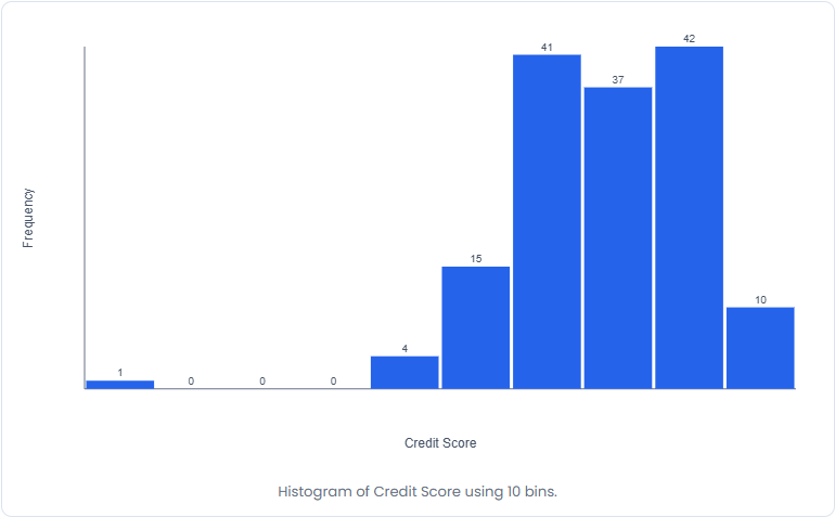
Figure 3.4 presents the distribution of Credit Score. Unlike Purchase Amount, this variable reflects customer card usage behaviour rather than financial activity. Examining the histogram allows analysts to determine whether most customers visiting a website credit score differences exist between casual visitors and highly engaged users. Such information becomes valuable in later modules when investigating relationships between browsing behaviour and purchasing decisions using correlation and regression analysis.
Histograms demonstrate one of the fundamental principles of exploratory data analysis: a single graph can often communicate more information than an entire page of numerical values. Throughout the remainder of this module, you will discover that different graphical techniques reveal different aspects of the same dataset. The next visualization, the boxplot, complements the histogram by providing a compact summary of the distribution while simultaneously highlighting variability and potential outliers.
Analytical Question: How are the data distributed, and are there any unusual observations or differences between groups?
While histograms provide a detailed picture of the overall shape of a distribution, analysts often require a more compact summary that highlights the centre, spread, and potential outliers of the data. The boxplot, sometimes called a box-and-whisker plot, was developed specifically for this purpose. Despite its simple appearance, the boxplot conveys a considerable amount of statistical information and has become one of the most widely used visualisation tools in exploratory data analysis.
A boxplot is constructed from the five-number summary introduced in Module 2. These five statistics consist of the minimum value, the first quartile (Q1), the median (Q2), the third quartile (Q3), and the maximum value. The box itself represents the interquartile range (IQR), extending from the first quartile to the third quartile and therefore containing the middle fifty percent of the observations. A horizontal line inside the box marks the median, providing an immediate indication of the centre of the distribution.
The lines extending from the box are known as whiskers. In most statistical software, the whiskers extend to the most extreme observations that are not considered unusual according to the 1.5 × IQR rule. Observations beyond these limits are displayed individually as points and are interpreted as potential outliers. It is important to recognise that an outlier is not necessarily an error. Instead, it is an observation that differs substantially from the majority of the data and therefore deserves further investigation before any decision is made about retaining or removing it.
One of the greatest strengths of the boxplot is its ability to compare several groups simultaneously. Unlike histograms, which become difficult to interpret when multiple distributions are displayed together, grouped boxplots allow analysts to compare medians, variability, skewness, and potential outliers across different categories in a clear and compact manner. For this reason, grouped boxplots are frequently used before conducting statistical procedures such as the independent-samples t-test or analysis of variance (ANOVA).
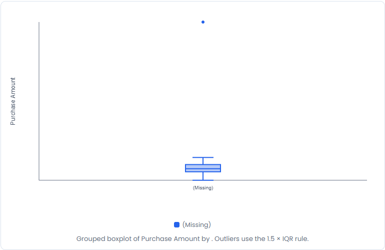
Figure 3.5 presents a boxplot of Purchase Amount from the LearnerBox Customer Purchases Dataset. Notice how the graph immediately summarises the centre of the distribution through the median, illustrates the spread of the middle fifty percent of observations using the interquartile range, and identifies unusually large purchases that appear as individual points beyond the whiskers. Information that would require several numerical statistics can therefore be communicated in a single compact figure. The boxplot also shows several outliers, which means data points that are more than 1.5 time the sample IQR value.
Use the LearnerBox Interactive Dataset to investigate the distribution of Purchase Amount using a boxplot.
Within the LearnerBox Interactive Dataset Viewer, select:
Examine the resulting graph and answer the following questions.
The boxplot provides an immediate summary of the distribution while drawing attention to observations that deserve further investigation. Compared with a histogram, the boxplot sacrifices some detail about the exact shape of the distribution but provides a much clearer summary of variability and potential outliers.
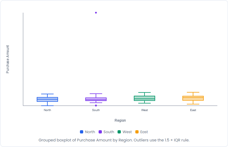
Grouped boxplots extend the usefulness of this visualisation by allowing several distributions to be compared simultaneously. In Figure 3.6, Purchase Amount is displayed separately for each geographical region. Rather than comparing dozens of individual observations, the analyst can immediately compare the medians, variability, and potential outliers for all four groups. Such visual comparisons frequently provide valuable insights before any formal statistical hypothesis tests are performed.
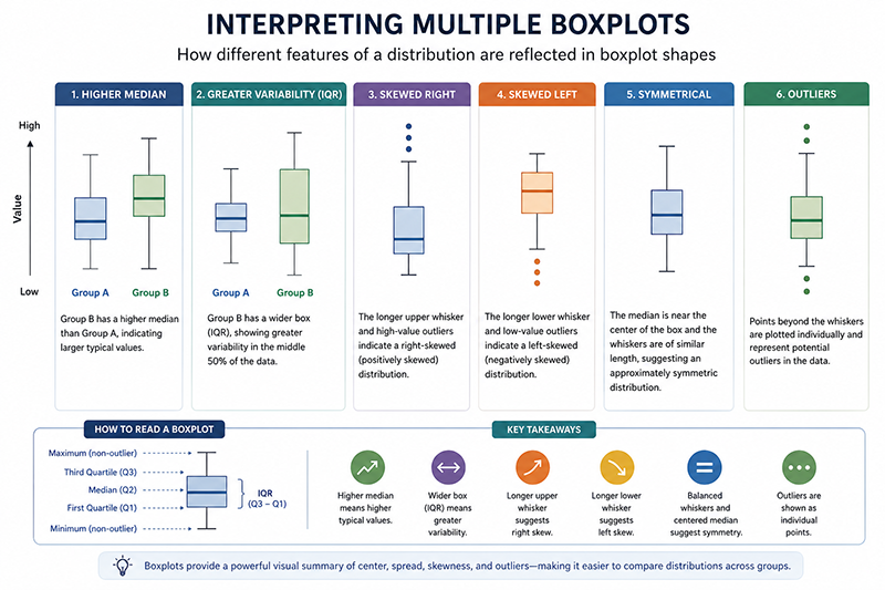
Figure 3.7 should be viewed as a general interpretation guide rather than the summary of a particular dataset. The purpose of this figure is to demonstrate how different characteristics of a distribution influence the appearance of a boxplot. By comparing several representative boxplots side by side, students can learn to recognise important distributional features without becoming distracted by the underlying numerical values.
The following characteristics are particularly important when interpreting boxplots.
As you compare the graphs, consider the following questions:
You will revisit these same grouped boxplots in Module 6 when studying Analysis of Variance (ANOVA), where visual observations will be supported by formal statistical tests.
Analytical Question: Are two numerical variables related to one another?
Many statistical investigations seek to determine whether changes in one numerical variable are associated with changes in another. For example, do customers with higher annual incomes tend to spend more money? Does the amount of time spent on a website influence purchase behaviour? Do students who study for more hours generally achieve higher examination scores? Questions such as these cannot be answered effectively using histograms or boxplots because those visualisations describe only one variable at a time. Instead, analysts use the scatterplot, one of the most informative graphical techniques in statistics.
A scatterplot displays the relationship between two numerical variables by representing each observation as a single point on a two-dimensional graph. The horizontal axis represents the explanatory variable (also called the independent or predictor variable), while the vertical axis represents the explained variable (also called the dependent or response variable). Rather than grouping observations into intervals, every data point is plotted individually, allowing the overall pattern of the relationship to emerge naturally.
Scatterplots provide considerably more information than simply indicating whether two variables are related. They help analysts assess the direction of the relationship, its strength, its form, and the possible presence of outliers. These four characteristics form the foundation of visual relationship analysis and will be explored quantitatively in the following modules.
The direction of the relationship indicates whether the variables tend to increase together or move in opposite directions. If larger values of one variable are generally associated with larger values of the other variable, the relationship is described as positive. Conversely, if larger values of one variable are generally associated with smaller values of the other variable, the relationship is described as negative. When no consistent pattern is apparent, the variables may exhibit little or no relationship.
The strength of the relationship refers to how closely the observations cluster around an underlying trend. When the points lie close to an imaginary straight line, the relationship is considered strong. When the points are widely scattered, the relationship is weaker. Importantly, visual inspection provides only an initial impression of relationship strength. In Module 4, this visual assessment will be quantified using the Pearson correlation coefficient, while Module 6 will extend the analysis through regression modelling.
Another important characteristic is the form of the relationship. Many statistical techniques assume that the association between two variables is approximately linear. A scatterplot allows analysts to evaluate this assumption before fitting statistical models. If the relationship follows a curved pattern, alternative analytical techniques may be more appropriate.
Finally, scatterplots frequently reveal outliers that differ markedly from the general pattern. These observations may represent data entry errors, unusual cases, or genuinely informative observations. Because influential observations can substantially affect regression models, they should always be investigated carefully rather than removed automatically.
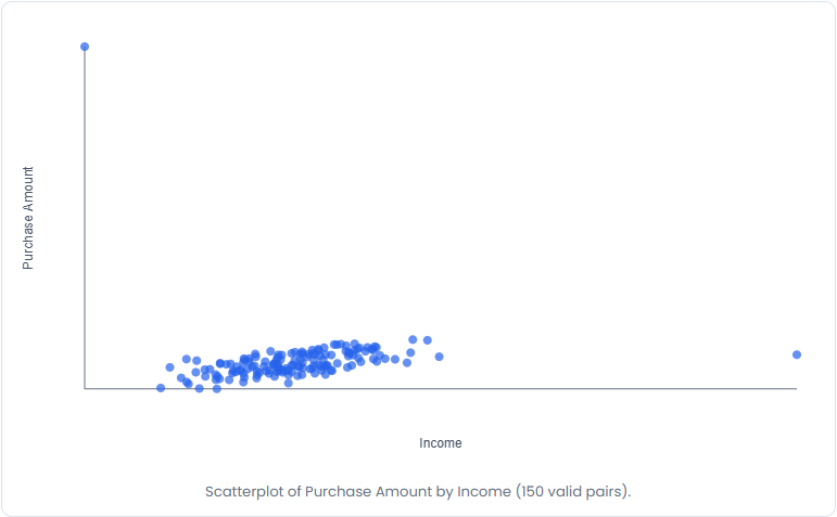
Figure 3.8 illustrates the relationship between Annual Income and Purchase Amount. Each point represents one customer from the LearnerBox Customer Purchases Dataset. Although some variability is expected, the overall pattern suggests that customers with higher annual incomes generally tend to spend more money. At the same time, the graph demonstrates that annual income alone does not completely determine purchasing behaviour, highlighting the influence of additional explanatory variables such as previous purchases, loyalty membership, promotional discounts, and customer preferences.
Use the LearnerBox Interactive Dataset to investigate the relationship between Annual Income and Purchase Amount.
Within the LearnerBox Interactive Dataset Viewer, select:
Before calculating any numerical statistics, examine the scatterplot carefully.
The scatterplot suggests a positive relationship between annual income and purchase amount. Although considerable variation exists, customers with larger annual incomes generally tend to make larger purchases. This visual impression will later be confirmed quantitatively through correlation and regression analysis.
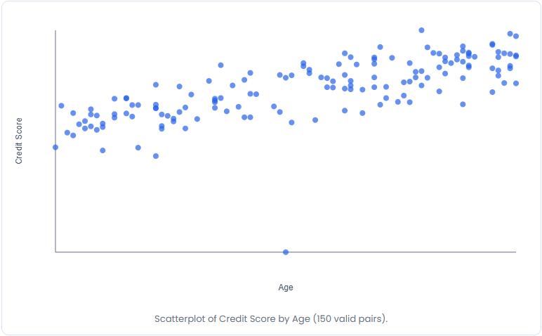
Unlike the previous example, Figure 3.9 compares a customer behavior variable and a demographic variable. The graph demonstrates how scatterplots can also be used to investigate behavioural relationships rather than purely economic ones. As customer age increases, the inclination to spend more using credit cards generally increases as well, illustrating another positive association that can later be modelled statistically.
For each scatterplot, describe:
Compare your visual conclusions with those of your classmates. Although different analysts may notice different features, the overall interpretation should be broadly consistent.
Scatterplots represent an important transition within this course. Until now, the emphasis has been on describing individual variables. Beginning with scatterplots, the focus shifts toward understanding relationships between variables, a theme that continues throughout the remainder of the textbook in correlation analysis, regression modelling, statistical learning, and artificial intelligence.
Analytical Question: How is a categorical variable divided into its constituent parts?
Not all variables consist of numerical measurements. Many datasets contain categorical variables that classify observations into distinct groups, such as geographical regions, product categories, customer segments, educational qualifications, or preferred software applications. When the objective is to illustrate the relative proportion contributed by each category to the whole dataset, one of the most familiar graphical techniques is the pie chart. Although simple in appearance, pie charts remain widely used in business reports, dashboards, market research, and management presentations because they communicate proportions quickly to non-technical audiences.
A pie chart represents an entire dataset as a circle divided into sectors. Each sector corresponds to one category, and the size of each sector is proportional to either its frequency or its percentage of the total observations. Categories that occur more frequently occupy larger sectors, whereas less common categories occupy correspondingly smaller sectors. Unlike histograms and scatterplots, which display numerical relationships, pie charts are intended exclusively for categorical data.
Because the human eye finds it easier to compare lengths than angles, statisticians generally recommend using pie charts only when the number of categories is relatively small and when the purpose is to communicate broad proportions rather than precise numerical differences. When many categories are present or when accurate comparisons between categories are required, a bar chart usually provides a more effective visualisation. Consequently, analysts should select pie charts carefully rather than using them by default.
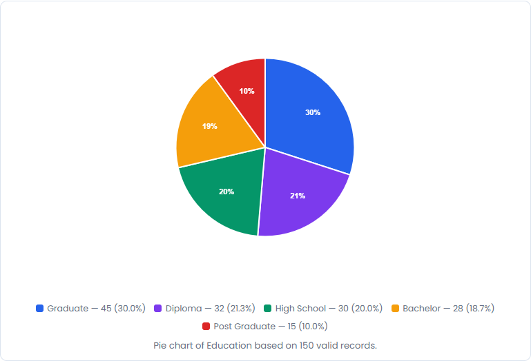
Figure 3.10 displays the distribution of customers across the various Education categories contained within the LearnerBox Customer Purchases Dataset. Rather than presenting the raw frequencies in a table, the pie chart immediately communicates the relative contribution of each category to the entire customer base. Managers can therefore identify dominant product segments at a glance without examining detailed numerical summaries.
Use the LearnerBox Interactive Dataset to determine the proportion of customers belonging to each education category.
Within the LearnerBox Interactive Dataset Viewer, select:
Observe the completed chart and answer the following questions.
The pie chart provides an immediate overview of the composition of the customer population. Although exact percentages can be obtained from numerical frequency tables, the visual representation makes it considerably easier to appreciate the relative importance of each category within the dataset.
One important principle should always be remembered when interpreting pie charts. The chart illustrates relative proportions, not numerical relationships. It cannot indicate trends, variability, correlations, or distributions. Consequently, pie charts complement rather than replace other statistical visualisations. Their primary purpose is to answer a single question: How is the whole divided among its categories?
If the dataset contains many categories or if accurate comparisons are required, consider using a bar chart instead.
After creating each chart, compare it with the corresponding bar chart.
Which visualisation allows you to compare the categories more accurately? Which visualisation communicates overall proportions more effectively? Reflect on the advantages and limitations of each graphical technique before proceeding to the next section.
Here are two more worked out examples for your practice.
A retail company wishes to understand whether the variable Credit Score is suitable for further statistical analysis. Before calculating descriptive statistics, the analyst decides to examine the distribution visually.
Using the LearnerBox Interactive Dataset, generate a histogram of Credit Score and interpret the distribution.
Within the LearnerBox Interactive Dataset Viewer, select:
Carefully inspect the resulting histogram and consider the following questions.
The histogram demonstrates why visual exploration should precede numerical analysis. Even before calculating the mean or standard deviation, the analyst gains valuable information about the overall distribution of website visits. If the histogram exhibits substantial skewness or contains unusually large observations, these characteristics should be considered when selecting subsequent statistical techniques. Visual interpretation therefore provides an important context for understanding later numerical summaries and statistical models.
An online retailer believes that customers with higher credit scores tend to make larger purchases. Before calculating a correlation coefficient or fitting a regression model, the analyst first examines the relationship visually.
Using the LearnerBox Interactive Dataset, construct a scatterplot of Credit Score and Purchase Amount.
Within the LearnerBox Interactive Dataset Viewer, select:
Study the resulting scatterplot and answer the following questions.
The scatterplot provides an initial visual assessment of the relationship between browsing behaviour and customer spending. If the points exhibit an upward linear trend, the analyst may reasonably anticipate a positive correlation between the variables. Conversely, a widely scattered pattern would suggest a weaker relationship. Importantly, the scatterplot also reveals unusual observations that may influence the strength of the relationship and should therefore be investigated before formal correlation or regression analyses are performed. This illustrates an important principle that will recur throughout the remainder of this course: every regression analysis should begin with a scatterplot.
At this point in the module you have encountered the principal graphical techniques used during exploratory data analysis. Histograms describe the distribution of numerical variables, boxplots summarise variability and identify potential outliers, scatterplots investigate relationships between numerical variables, while pie charts communicate the composition of categorical variables. The final section of this module brings these visualisations together by developing a practical framework for selecting the most appropriate chart for any analytical question.
One of the most common mistakes made by beginning analysts is to select a graph simply because it is familiar rather than because it is appropriate. Effective data visualization begins not with the graph itself but with a clear understanding of the analytical question. Once the objective of the analysis has been established, the choice of visualization becomes much more straightforward. Throughout this module, you have seen that each graphical technique highlights different characteristics of the data, and no single graph is suitable for every situation.
A useful way to approach visualization is to begin by identifying the type of variables involved. If the objective is to describe the distribution of a single numerical variable, a histogram is usually the most informative choice. If the goal is to summarise the distribution while identifying variability and potential outliers, a boxplot provides a more compact representation. When the objective is to investigate the relationship between two numerical variables, a scatterplot allows the analyst to examine direction, strength, linearity, and unusual observations. Finally, when the purpose is to communicate the relative proportions of a categorical variable, a pie chart provides an effective visual summary, particularly when only a small number of categories are present.
Selecting an appropriate graph is not merely a matter of presentation. The visualization chosen often determines how quickly patterns are recognised, whether assumptions are questioned, and whether important observations receive further investigation. Consequently, experienced analysts rarely ask, "Which graph should I draw?" Instead, they ask, "What question am I trying to answer?" The graph then becomes a tool for answering that question as clearly and accurately as possible.
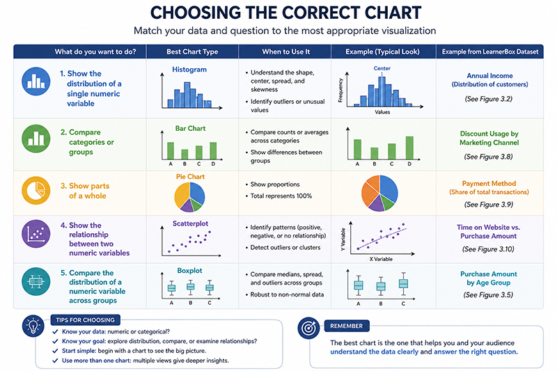
Figure 3.11 summarises the principal visualization techniques introduced in this module and the situations in which they are most appropriately used.
| Analytical Question | Recommended Visualization |
|---|---|
| What does the distribution of a numerical variable look like? | Histogram |
| Are there unusual observations or differences between groups? | Boxplot |
| Are two numerical variables related? | Scatterplot |
| How is a categorical variable divided into its constituent parts? | Pie Chart |
| Is a numerical variable normally distributed? | Q-Q Plot |
| Which visualization should I choose? | Select the graph that best answers the analytical question rather than the one that appears most familiar. |
The following exercises are designed to reinforce the concepts introduced throughout this module by encouraging you to explore the LearnerBox Interactive Dataset. Unless otherwise stated, use the embedded dataset viewer to generate each visualization before attempting to answer the accompanying questions.
Which three graphs would you choose, and why?
There is no single correct answer. Your selection should depend on the questions you believe management would most likely wish to answer.
Data visualization represents one of the most important stages of statistical analysis because it transforms raw numerical information into meaningful visual patterns that can be interpreted quickly and effectively. Throughout this module, you learned that visual exploration should generally precede numerical analysis, allowing analysts to understand the characteristics of a dataset before calculating descriptive statistics or fitting statistical models. You examined the principal graphical techniques used in exploratory data analysis, including histograms, boxplots, scatterplots, and pie charts, and learned that each visualization answers a different analytical question. By working directly with the LearnerBox Interactive Dataset, you also experienced how modern statistical software allows analysts to investigate data dynamically rather than relying solely on static textbook examples. These graphical techniques provide the visual foundation upon which the remaining modules of this course will build, particularly in correlation analysis, regression modelling, hypothesis testing, and artificial intelligence.
Take a short Quiz and find your score. You can always come back to this page and go through the content again!